🔥 Today Only: Save 30% on Premium — Offer Ends Soon! - Upgrade Now!
Line Graph

Band 6+: The line chart below shows the results of a survey giving the reasons why people moved to the capital city of a particular country. Summarize the information by selecting and reporting the main features and make comparisons where relevant. Writing at least 150 words

Image for topic: The line chart below shows the results of a survey giving the reasons why people moved to the capital city of a particular country. Summarize the information by selecting and reporting the main features and make comparisons where relevant. Writing at least 150 words
Our system will evaluate the answer based on this AI-generated description.
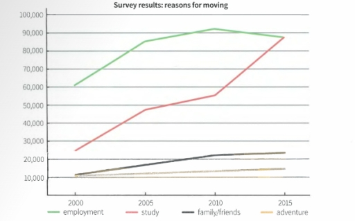
The image is a line graph titled "Survey results: reasons for moving" with the y-axis ranging from 10,000 to 100,000 and x-axis from 2000 to 2015 in 5-year increments; four lines represent different reasons - employment (lightest color), study (second lightest), family/friends (second darkest), adventure (darkest); employment line starts around 30,000 in 2000, gently rises to about 34,000 in 2005, steeply to about 65,000 in 2010, then more gently to just below 70,000 in 2015; study starts around 25,000 in 2000, gently rises to about 30,000 in 2005, steeply to about 57,000 in 2010, then more gently to just below 60,000 in 2015; family/friends starts around 12,000 in 2000, remains stable until 2005, rises slightly to about 15,000 in 2010, then sharply to about 40,000 in 2015; adventure starts around 20,000 in 2000, remains stable until 2005, rises slightly to about 22,000 in 2010, then steeply to about 85,000 in 2015.
Given the complexity of the image, the above description may not be entirely accurate.
Note: Both the topic and the answer were created by one of our users.

The line graph demonstrates the result of a survey giving factors influencing people’s movement to the capital city of a country between 2000 and 2015.

Overall, there was four reasons for settling in the capital: employment, study, family/friends and adventure. Additionally, the highest figures belonged to employment and the joint-lowest was for adventure.

In 2000, employment increased rapidly from over 60,000 and ended with around 85,000 in 2005. Then, it continued rising progressively between 2005 and 2010 and reached at more than 90,000. Job started to drop steadily to under 90,000 in 2015. For study reason, it kept rise up significantly through 15 years and reached the same level as employment reason in 2015.

The family/friends had the same starting point with adventure reason in 2000. Family/friends climbed continuously over 20,000 in 2010 and experiencing a slow increase to 2015. Along with that, adventure rose slightly and regularly from over 10,000to approximate 15,000 in 15 years.

Word Count: 156

Answers On The Same Topic:

The line chart below shows the results of a survey giving the reasons why people moved to the capital city of a particular country. Summarize the information by selecting and reporting the main features and make comparisons where relevant. Writing at least 150 words

This graphic chart shows us some tendencies in emigration in a 15-year period and reasons for it including employment, academical reasons, reunion with families or friends and moving for adventures. Overall, we can see that there is an upward trend in all lines of the chart. The most significant growth we can see is in […]

The line chart below shows the results of a survey giving the reasons why people moved to the capital city of a particular country. Summarize the information by selecting and reporting the main features and make comparisons where relevant. Writing at least 150 words

This graphic chart shows us some tendencies in people moving to a foreign country and their reasons for it. Overall, we can see that there’s an upward trend in all lines of the chart. The most significant growth we can see in the nuber of people moving for study. In 2000 it reaches only below […]

The line chart below shows the results of a survey giving the reasons why people moved to the capital city of a particular country. Summarize the information by selecting and reporting the main features and make comparisons where relevant. Writing at least 150 words

The line chart illustrates the shifting trends in motivations for why individuals migrated to the capital city between 2000 and 2015 in a specific country. Overall, the graph suggests the number of people relocating to the city rose across the period for all four main purposes. While employment and study were the primary drivers of […]

The line chart below shows the results of a survey giving the reasons why people moved to the capital city of a particular country. Summarize the information by selecting and reporting the main features and make comparisons where relevant. Writing at least 150 words

The line graph illustrates the amount of four kinds of patterns (employment, study, family/friends, adventure) as fundamental motives of relocation from 2000 to 2015. units are measured in number of people. Initially, three menthoned points of the four ones start with a gradual increase. Specifically, the study reason data was doubled from 25000 to 50 […]

See All

Other Topics:

The line chart below shows the percentage of people in different age groups who played video games more than ten hours a week between 2010 and 2015

The data presents the percentage of different ages people, who spent more than 10 hours per week by playing video games. In general, the category of people who are from 16 to 24 dominated the graph over the provided period. On the contrary, seniors registered fairly low figures.Those aged from 25 to 64 occupied the […]

he graph below shows the number of immigrants to there countries from 1990 to 2001. Summarise the information by selecting and reporting the main features, and make comparisons where relevant.

The line graph illustrates the persantages of immigrants came in 1990 and 2001. overall USA experienced an upward trend by domanating, whereas Canada and Australia stay stable over the period . in the first year in USA the figure for people came from another country climbed from about 1300 to 1800 in 1992 . however […]

The line chart below shows the percentage of people in different age groups who played video games more than ten hours a week between 2010 and 2015

The data presents the percentage of different aged people, who spent more than 10 hours per week by playing video games. In general, the category of people who are from 16 to 24 were on the top of the graph over the provided period. On the contrary, seniors registered fairly low figures.Those aged from 25 […]

The line shows the number of inquiries received by the Tourist Information Office in one day over six months in 2011 (telephone, letter/email, and in person).

The line graph compares three methods of collecting daily inquiries by the Tourist Information Office during a six-month period in 2011. Overall, most categories observed strong upswings, except for gathering inquiries by letter/email, which showed a reverse pattern. Additionally, the most considerable escalation was witnessed in the in-person criterion. Regarding the two groups with the […]

The graph below shows the investment trends of men and women in the UK since 1950. Summarise the information by selecting and reporting the main features, and make comparisons where relevant.

The chart illustrates information on how men and women made investments in the UK from 1950 to 1980. Overall, the amount of money invested by both men and women rose significantly over the time period. However, while men’s investments fluctuated, the numbers for women grew more consistently. At the start of the time period, the […]

The line graph illustrate thefts per 1000 vehicles in the four different countries over the 9 years.

The line graph provided illustrates the thefts per thousand vehicles between Great Britain, Sweden, France and Canada in 10 years. Overall, Great Britain consistently recorded the highest number of vehicle thefts throughout the period, although there were some fluctuations. In contrast, Sweden experienced a steady increase, while France and Canada remained lower and relatively stable. […]

See All
We have detected unusual activity on your device.
Please verify your identity to continue.
Note: This verification step won't sign you in. If you have a premium account, please log in to access the service as usual.
Google/Gmail Verification
Or verify using Email/Code
We've sent a verification code to:
youremail@gmail.com (Not your email?)
Enter it below to complete the verification process.
Ensure your email address is correct, your inbox is not full, and you check your spam folder. If no email arrives, consider using an alternative email.
You will need a Premium plan to perform your action!
Note: If you already have a premium account, please log in to access our services as usual.

Plans & Pricing

Our mission is to make quality education accessible for everyone.
However, to keep our hardworking team running and this service alive, we genuinely need your support!
By opting for a premium plan, not only do you sustain us in achieving the mission, but you also unlock advanced features to enrich your learning experience.

Free

For learners who aren't pressed for time

What's included on Free
100+ Cambridge IELTS Tests
Instant IELTS Writing Task 1 & 2 Evaluation (2 times/month)
Instant IELTS Speaking Part 1, 2, & 3 Evaluation (5 times/month)
Instant IELTS Writing Task 1 & 2 Essay Generator (2 times/month)
500+ Dictation & Shadowing Exercises
100+ Pronunciation Exercises
Flashcards
Other Advanced Tools

Premium

For those serious about advancing their English proficiency, and for IELTS candidates aspiring to boost their band score by 1-2 points (especially in writing & speaking) in just 30 days or less

What's included on Premium
Save Your IELTS Test Progress
Unlock All Courses & IELTS Tests
Unlimited AI Conversations
Unlimited AI Writing Enhancement Exercises
Unlimited IELTS Writing Task 1 & 2 Evaluation
Unlimited IELTS Speaking Part 1, 2, & 3 Evaluation
Checked Answers Will Not Be Published
Unlimited IELTS Writing Task 1 & 2 Essay Generator
Unlimited IELTS Speaking Part 1, 2, & 3 Sample Generator
Unlimited Usage Of Advanced Tools
Priority Support within 24h (12-month plan only)

Due to the nature of our service and the provided free trials, payments are non-refundable.
Nếu bạn là người Việt Nam và không có hoặc không muốn trả bằng credit/debit cards, bạn có thể thanh toán bằng phương thức chuyển khoản:


Chọn gói:
419,000₫ 277,000 ₫ cho gói 1 tháng (chỉ 9,233₫/ngày)
1,239,000₫ 597,000 ₫ cho gói 3 tháng (chỉ 6,633₫/ngày)
2,469,000₫ 1,027,000 ₫ cho gói 6 tháng (chỉ 5,706₫/ngày)
4,929,000₫ 1,417,000 ₫ cho gói 12 tháng (chỉ 3,936₫/ngày)


Sau khi chuyển khoản, vui lòng đợi trình duyệt tự động điều hướng bạn trở lại Engnovate và bạn sẽ ngay lập tức nhận được mã kích hoạt tài khoản premium.
Nếu có lỗi xảy ra, bạn có thể liên hệ với team thông qua một trong các phương thức: email đến helloengnovate@gmail.com hoặc nhắn tin qua facebook.com/engnovate.
Vì toàn bộ công cụ trên website đều có thể sử dụng thử miễn phí, Engnovate không hỗ trợ hoàn tiền.