🔥 Today Only: Save 30% on Premium — Offer Ends Soon! - Upgrade Now!
Line Graph

Band 5+: The line chart below shows the results of a survey giving the reasons why people moved to the capital city of a particular country. Summarize the information by selecting and reporting the main features and make comparisons where relevant. Writing at least 150 words

Image for topic: The line chart below shows the results of a survey giving the reasons why people moved to the capital city of a particular country. Summarize the information by selecting and reporting the main features and make comparisons where relevant. Writing at least 150 words
Our system will evaluate the answer based on this AI-generated description.
The image is a line graph titled "Survey results: reasons for moving" with the y-axis ranging from 10,000 to 100,000 and x-axis from 2000 to 2015 in 5-year increments; four lines represent different reasons - employment (lightest color), study (second lightest), family/friends (second darkest), adventure (darkest); employment line starts around 30,000 in 2000, gently rises to about 34,000 in 2005, steeply to about 65,000 in 2010, then more gently to just below 70,000 in 2015; study starts around 25,000 in 2000, gently rises to about 30,000 in 2005, steeply to about 57,000 in 2010, then more gently to just below 60,000 in 2015; family/friends starts around 12,000 in 2000, remains stable until 2005, rises slightly to about 15,000 in 2010, then sharply to about 40,000 in 2015; adventure starts around 20,000 in 2000, remains stable until 2005, rises slightly to about 22,000 in 2010, then steeply to about 85,000 in 2015.
Given the complexity of the image, the above description may not be entirely accurate.
Note: Both the topic and the answer were created by one of our users.

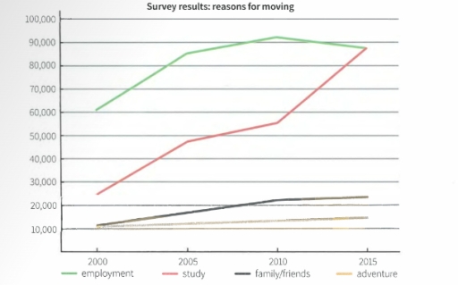
The line graph illustrates the amount of four kinds of patterns (employment, study, family/friends, adventure) as fundamental motives of relocation from 2000 to 2015. units are measured in number of people.

Initially, three menthoned points of the four ones start with a gradual increase. Specifically, the study reason data was doubled from 25000 to 50 000 during the 5 years.

Regarding the data variability, adventures have no downfalls and remain stable likewise family/friends feature which has consistently increased from 2000 to 2010 and after that remained approximately 25 000 loyal residents.

Overall, from 2000 employment is presented as a prominent aspect why people change the location and move from the megapolis to a specific country.

It can be clearly seen that there was a considerable decrease in employment reasons from the last five years, which finally got around the same amount that was in 2005. In contrast, the study gradually raised its data and 2015 picked its maximum point. Eventually, With regards to the 2015 data , employment and study futures were equalized and at around 88 000 people nominated them as the reason for the transition.

Word Count: 187

Answers On The Same Topic:

The line chart below shows the results of a survey giving the reasons why people moved to the capital city of a particular country. Summarize the information by selecting and reporting the main features and make comparisons where relevant. Writing at least 150 words

This graphic chart shows us some tendencies in emigration in a 15-year period and reasons for it including employment, academical reasons, reunion with families or friends and moving for adventures. Overall, we can see that there is an upward trend in all lines of the chart. The most significant growth we can see is in […]

The line chart below shows the results of a survey giving the reasons why people moved to the capital city of a particular country. Summarize the information by selecting and reporting the main features and make comparisons where relevant. Writing at least 150 words

This graphic chart shows us some tendencies in people moving to a foreign country and their reasons for it. Overall, we can see that there’s an upward trend in all lines of the chart. The most significant growth we can see in the nuber of people moving for study. In 2000 it reaches only below […]

The line chart below shows the results of a survey giving the reasons why people moved to the capital city of a particular country. Summarize the information by selecting and reporting the main features and make comparisons where relevant. Writing at least 150 words

The line chart illustrates the shifting trends in motivations for why individuals migrated to the capital city between 2000 and 2015 in a specific country. Overall, the graph suggests the number of people relocating to the city rose across the period for all four main purposes. While employment and study were the primary drivers of […]

The line chart below shows the results of a survey giving the reasons why people moved to the capital city of a particular country. Summarize the information by selecting and reporting the main features and make comparisons where relevant. Writing at least 150 words

The line graph demonstrates the result of a survey giving factors influencing people’s movement to the capital city of a country between 2000 and 2015. Overall, there was four reasons for settling in the capital: employment, study, family/friends and adventure. Additionally, the highest figures belonged to employment and the joint-lowest was for adventure. In 2000, […]

See All

Other Topics:

The chart below shows the changes that took place in three different areas of crime in Newport city centre from 2003 - 2012. Summarise the information by selecting and reporting the main features, and make comparisons where relevant.

The line graph illustrates the changes in three types of crime in burglary, car theft, and robbery in Newport city centre between 2003 and 2012. Overall, burglary showed a significant decline over the period, while car theft fluctuated but ended as the most common crime. Robbery remained the least frequent type throughout the years, with […]

The chart below shows the changes that took place in three different areas of crime in Newport city centre from 2003 - 2012. Summarise the information by selecting and reporting the main features, and make comparisons where relevant.

The line graph illustrate the changes in three types of crime in burglary , car theft and robbery in new port city from 2003 to 2012 Overall Bulgaria showed a significant decline over the period, while car theft slightly increased . Robbery remained the least throughout the year with slight changes. In2003 Bulagary was the […]

Writing task 1 The line graph illustrates the amount of spreads consumed from 1981 to 2007, in grams per person per week

The graph below depicts the three spreads consumption, namely margarine, Low fat spreads and butter between 1981 and 2007. Overall, butter increased at the beginning of the period. Then, dropped by the end of the period. Moreover, margarine trend fell from the start until the end. The low fat and reduce spreads, they rapidly increased […]

The graph shows information regarding new Facebook users by age group in Cambodia between February and December 2020.

The line graph illustrates the count of new Facebook profiles across three age groups in eleven-month span. Generally, the figures for every age groups ultimately increased, albeit to various degrees, except middle-aged individuals; while the amounts of young adults experienced the biggest change, that of teens rose negligible, mainly because of age restrictions. In addition, […]

The graph below shows the number of tourists visiting a particular Caribbean island between 2010and 2017 Summarise the information by selecting and reporting the main features and make comparisons where relevant

The graph illustrates number of people who visit Caribbean island from 2010 to 2017. Overall, years by year more tourist was coming to Caribbean island, at the began major part stayed at island, after number of tourists on cruise ships increased. in 2010, million people visited the island and 75 percent tourist stayed on Caribbean, […]

The graph below shows the amount of goods transported in the United Kingdom by four different types of transport between 1980 and 2008. Summarise the information by selecting and reporting the main features, and make comparisons

The given line graph demonstrates the figure of goods transported in the United Kingdom by four different categories of transfer: road, water, pipeline and rail from 1980 to 2008. Overall, most transport experienced upward trends, namely road, water, and pipeline, while rail remained unchanged throughout the given period. Additionally, this graph is led by road, […]

See All
We have detected unusual activity on your device.
Please verify your identity to continue.
Note: This verification step won't sign you in. If you have a premium account, please log in to access the service as usual.
Google/Gmail Verification
Or verify using Email/Code
We've sent a verification code to:
youremail@gmail.com (Not your email?)
Enter it below to complete the verification process.
Ensure your email address is correct, your inbox is not full, and you check your spam folder. If no email arrives, consider using an alternative email.
You will need a Premium plan to perform your action!
Note: If you already have a premium account, please log in to access our services as usual.

Plans & Pricing

Our mission is to make quality education accessible for everyone.
However, to keep our hardworking team running and this service alive, we genuinely need your support!
By opting for a premium plan, not only do you sustain us in achieving the mission, but you also unlock advanced features to enrich your learning experience.

Free

For learners who aren't pressed for time

What's included on Free
100+ Cambridge IELTS Tests
Instant IELTS Writing Task 1 & 2 Evaluation (2 times/month)
Instant IELTS Speaking Part 1, 2, & 3 Evaluation (5 times/month)
Instant IELTS Writing Task 1 & 2 Essay Generator (2 times/month)
500+ Dictation & Shadowing Exercises
100+ Pronunciation Exercises
Flashcards
Other Advanced Tools

Premium

For those serious about advancing their English proficiency, and for IELTS candidates aspiring to boost their band score by 1-2 points (especially in writing & speaking) in just 30 days or less

What's included on Premium
Save Your IELTS Test Progress
Unlock All Courses & IELTS Tests
Unlimited AI Conversations
Unlimited AI Writing Enhancement Exercises
Unlimited IELTS Writing Task 1 & 2 Evaluation
Unlimited IELTS Speaking Part 1, 2, & 3 Evaluation
Checked Answers Will Not Be Published
Unlimited IELTS Writing Task 1 & 2 Essay Generator
Unlimited IELTS Speaking Part 1, 2, & 3 Sample Generator
Unlimited Usage Of Advanced Tools
Priority Support within 24h (12-month plan only)

Due to the nature of our service and the provided free trials, payments are non-refundable.
Nếu bạn là người Việt Nam và không có hoặc không muốn trả bằng credit/debit cards, bạn có thể thanh toán bằng phương thức chuyển khoản:


Chọn gói:
419,000₫ 277,000 ₫ cho gói 1 tháng (chỉ 9,233₫/ngày)
1,239,000₫ 597,000 ₫ cho gói 3 tháng (chỉ 6,633₫/ngày)
2,469,000₫ 1,027,000 ₫ cho gói 6 tháng (chỉ 5,706₫/ngày)
4,929,000₫ 1,417,000 ₫ cho gói 12 tháng (chỉ 3,936₫/ngày)


Sau khi chuyển khoản, vui lòng đợi trình duyệt tự động điều hướng bạn trở lại Engnovate và bạn sẽ ngay lập tức nhận được mã kích hoạt tài khoản premium.
Nếu có lỗi xảy ra, bạn có thể liên hệ với team thông qua một trong các phương thức: email đến helloengnovate@gmail.com hoặc nhắn tin qua facebook.com/engnovate.
Vì toàn bộ công cụ trên website đều có thể sử dụng thử miễn phí, Engnovate không hỗ trợ hoàn tiền.