🔥 Today Only: Save 30% on Premium — Offer Ends Soon! - Upgrade Now!
Table

Band 9: The table below gives information about the problems faced by children in two primary schools in 2005 and 2015.

Image for topic: The table below gives information about the problems faced by children in two primary schools in 2005 and 2015.
Our system will evaluate the answer based on this AI-generated description.
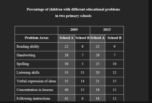
The image presents a table with data on the percentage of children with different educational problems in two primary schools across two years, 2005 and 2015. Problem areas are divided into Reading ability, Handwriting, Spelling, Listening skills, Verbal expression of ideas, Concentration in lessons, and Following instructions. School A in 2005 shows 22% in Reading ability, 28% in Handwriting, 30% in Spelling, 35% in Listening skills, 35% in Verbal expression of ideas, 40% in Concentration in lessons, and 42% in Following instructions. School B in 2005 shows 8% in Reading ability, 7% in Handwriting, 5% in Spelling, 11% in Listening skills, 14% in Verbal expression of ideas, 15% in Concentration in lessons, and 6% in Following instructions. In 2015, School A percentages are 23% in Reading ability, 28% in Handwriting, 25% in Spelling, 20% in Listening skills, 21% in Verbal expression of ideas, 18% in Concentration in lessons, and 18% in Following instructions. In 2015, School B percentages are 9% in Reading ability, 7% in Handwriting, 10% in Spelling, 12% in Listening skills, 15% in Verbal expression of ideas, 15% in Concentration in lessons, and 12% in Following instructions.
Given the complexity of the image, the above description may not be entirely accurate.
Note: Both the topic and the answer were created by one of our users.

The table illustrates the challenges encountered by children in two primary schools in 2005 and 2015.

Overall, school A had a higher percentage of students facing educational difficulties compared to school B. The prevalence of problems decreased in school A but increased in school B over the specified period.

In the year 2005, school A had notably higher percentages of students experiencing issues in all categories compared to school B. For instance, 42% of students in school A had trouble following instructions, while the same issue affected only 6% of students in school B. Additionally, the range of problems faced by students in school A varied from 22% to 40%, whereas in school B, the percentages fluctuated between 5% and 15%.

Between 2005 and 2015, the proportion of students encountering challenges in concentrating during lessons and following instructions at school A saw a significant decrease to approximately 18%. Moreover, a decline was observed in the percentages of students grappling with other educational hindrances at school A. In contrast, at school B, there was a twofold increase in the prevalence of spelling and following instruction difficulties to around 10% and 12% respectively, with the other educational problems showing no change in percentages.

Word Count: 201

Answers On The Same Topic:

The table below gives information about the problems faced by children in two primary schools in 2005 and 2015.

The table presents the percentage of children experiencing various educational difficulties in two primary schools in 2005 and 2015. Overall, School A had a significantly higher percentage of students struggling with educational issues compared to School B in both years. However, while School A saw a noticeable improvement across all problem areas over the decade, […]

The table below gives information about the problems faced by children in two primary schools in 2005 and 2015.

The table illustrates the percentages of children experiencing various educational difficulties in two primary schools (School A and School B) in 2005 and 2015. Overall, School A saw a significant decline in the proportion of children facing educational problems over the decade, whereas School B experienced a slight increase in most categories. The most common […]

The table below gives information about the problems faced by children in two primary schools in 2005 and 2015.

The table provides data about the proportions of students facing numerous educational obstacles in two primary schools, namely school A and school B, during the years 2005 and 2015. Overall, significant reductions in the percentages of students with learning difficulties was witnessed in school A, while the reverse was true for school B. In school […]

The table below gives information about the problems faced by children in two primary schools in 2005 and 2015.

The table compares the percentages of students in two elementary schools suffering from seven educational problems in 2005 and 2015. Overall, over ten years, the impact of most educational issues on students in school A alleviated, except for reading ability and handwriting, while the severity of every educational problem was exacerbated for school B. Nevertheless, […]

The table below gives information about the problems faced by children in two primary schools in 2005 and 2015.

The table illustrates the proportions of students at two primary schools who faced seven distinct educational challenges in 2005 and 2015. To sum up, School A had a larger share of children experiencing all seven educational challenges in both years. In addition, while School A reduced the number of most issues from 2005 to 2015, […]

See All

Other Topics:

The chart below shows the cost-of-living averages in two different cities as compared to the national cost-of-living average. Summarize the information by selecting and reporting the main features, and make comparisons where relevant.

The table chart illustrates the average of living cost in two different cities when it is compared to the national living cost average. Overall, Riverdale averages above the national average for every housing expense. In contrast, Cape Alicia generally has lower living cost particularly in housing and transportation, while the other categories are above the […]

You should spend about 20 minutes on this task. The table below shows the percentage of households with selected electronic goods in New Zealand in 2002 and 2020. Summarize the information by selecting and reporting the main features, and make comparisons where relevant. You should write at least 150 words.

The table illustrates changes in the number of household electronic items across seven different categories between 2002 and 2020 in New Zealand. In general, it is noticeable that different trends were observed in all the given categories. While washing machines and color TVs recorded the highest figure of households electronic goods for the whole period, […]

You should spend about 20 minutes on this task. The table below shows the percentage of households with selected electronic goods in New Zealand in 2002 and 2020. Summarize the information by selecting and reporting the main features, and make comparisons where relevant. You should write at least 150 words.

The table illustrates changes in the number of households electronic items across seven different categories between 2002 and 2020 in New Zealand. In general, it is noticeable that different trends were observed in all the given periods. While washing machine and color tv recorded the highest figure of households electronic goods for the whole year, […]

The table below shows the proportion of women in the labor force and women in management in 5 counties.

The table illustrates the share of women in the labour force and management. Overall, Australia and the United States showed the relatively high figures in the both categories, whreas Egypt recorded relatively low figures. Meanwhile, Sri Lanka and Japan had the notable gap between the two categories. Looking at the data in more details, both […]

The table below shows water use for different purposes in four countries. The use of water by four different countries (%) Country Domestic use Industry Agriculture Egypt 8 10 82 Saudi Arabia 6 30 64 New Zealand 10 46 44 Canada 20 70 10

UThe table below shows water use for different purposes in four countries. The table illustrates information about the consumption of water for various purposes in four countries such as Egypt, Saudi Arabia, New Zealand and Canada. Overall, it is also clear that In Domestic use has many low consumptions in each nations. Whereas Industry and […]

See All
We have detected unusual activity on your device.
Please verify your identity to continue.
Note: This verification step won't sign you in. If you have a premium account, please log in to access the service as usual.
Google/Gmail Verification
Or verify using Email/Code
We've sent a verification code to:
youremail@gmail.com (Not your email?)
Enter it below to complete the verification process.
Ensure your email address is correct, your inbox is not full, and you check your spam folder. If no email arrives, consider using an alternative email.
You will need a Premium plan to perform your action!
Note: If you already have a premium account, please log in to access our services as usual.

Plans & Pricing

Our mission is to make quality education accessible for everyone.
However, to keep our hardworking team running and this service alive, we genuinely need your support!
By opting for a premium plan, not only do you sustain us in achieving the mission, but you also unlock advanced features to enrich your learning experience.

Free

For learners who aren't pressed for time

What's included on Free
100+ Cambridge IELTS Tests
Instant IELTS Writing Task 1 & 2 Evaluation (2 times/month)
Instant IELTS Speaking Part 1, 2, & 3 Evaluation (5 times/month)
Instant IELTS Writing Task 1 & 2 Essay Generator (2 times/month)
500+ Dictation & Shadowing Exercises
100+ Pronunciation Exercises
Flashcards
Other Advanced Tools

Premium

For those serious about advancing their English proficiency, and for IELTS candidates aspiring to boost their band score by 1-2 points (especially in writing & speaking) in just 30 days or less

What's included on Premium
Save Your IELTS Test Progress
Unlock All Courses & IELTS Tests
Unlimited AI Conversations
Unlimited AI Writing Enhancement Exercises
Unlimited IELTS Writing Task 1 & 2 Evaluation
Unlimited IELTS Speaking Part 1, 2, & 3 Evaluation
Checked Answers Will Not Be Published
Unlimited IELTS Writing Task 1 & 2 Essay Generator
Unlimited IELTS Speaking Part 1, 2, & 3 Sample Generator
Unlimited Usage Of Advanced Tools
Priority Support within 24h (12-month plan only)

Due to the nature of our service and the provided free trials, payments are non-refundable.
Nếu bạn là người Việt Nam và không có hoặc không muốn trả bằng credit/debit cards, bạn có thể thanh toán bằng phương thức chuyển khoản:


Chọn gói:
419,000₫ 277,000 ₫ cho gói 1 tháng (chỉ 9,233₫/ngày)
1,239,000₫ 597,000 ₫ cho gói 3 tháng (chỉ 6,633₫/ngày)
2,469,000₫ 1,027,000 ₫ cho gói 6 tháng (chỉ 5,706₫/ngày)
4,929,000₫ 1,417,000 ₫ cho gói 12 tháng (chỉ 3,936₫/ngày)


Sau khi chuyển khoản, vui lòng đợi trình duyệt tự động điều hướng bạn trở lại Engnovate và bạn sẽ ngay lập tức nhận được mã kích hoạt tài khoản premium.
Nếu có lỗi xảy ra, bạn có thể liên hệ với team thông qua một trong các phương thức: email đến helloengnovate@gmail.com hoặc nhắn tin qua facebook.com/engnovate.
Vì toàn bộ công cụ trên website đều có thể sử dụng thử miễn phí, Engnovate không hỗ trợ hoàn tiền.