🔥 Today Only: Save 30% on Premium — Offer Ends Soon! - Upgrade Now!
Multiple Graphs

Band 6+: WRITING TASK 1 You should spend about 20 minutes on this task. The graphs below show the number of men and women in full and part-time employment in Australia between 1973 and 1993. Summarise the information by selecting and reporting the main features and make comparison where relevant

Image for topic: WRITING TASK 1 You should spend about 20 minutes on this task. The graphs below show the number of men and women in full and part-time employment in Australia between 1973 and 1993. Summarise the information by selecting and reporting the main features and make comparison where relevant
Our system will evaluate the answer based on this AI-generated description.
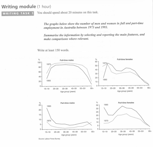
The image consists of four line graphs displaying employment data in Australia across three distinct age groups (15-19, 20-24, 25-29, 30-34, 35-39, 40-44, 45-49, 50-54, 55-59, 60-64, 65+) for 1973 and 1993. Full-time male employment in 1973: 60% (15-19), 90% (20-24), 95% (25-29 to 45-49), 92% (50-54), 88% (55-59), 70% (60-64), 20% (65+); in 1993: 50% (15-19), 81% (20-24), 90% (25-29 to 50-54), 80% (55-59), 60% (60-64), 20% (65+). Full-time female employment in 1973: 50% (15-19), 40% (20-24), 35% (25-29), 30% (30-34), 35% (35-39), 40% (40-44), 35% (45-49), 30% (50-54 to 55-59), 10% (60-64), 0% (65+); in 1993: 40% (15-19), 50% (20-24 to 30-34), 55% (35-39), 60% (40-44), 58% (45-49), 50% (50-54 to 55-59), 20% (60-64), 0% (65+). Part-time male employment in 1973: 5% (15-19), 2% (20-24), 1% (25-29 to 35-39), 2% (40-44), 3% (45-49), 4% (50-54), 8% (55-59), 15% (60-64), 20% (65+); in 1993: 8% (15-19), 5% (20-24), 3% (25-29), 4% (30-34), 3% (35-39), 4% (40-44 to 50-54), 5% (55-59), 15% (60-64), 25% (65+). Part-time female employment in 1973: 5% (15-19), 15% (20-24), 12% (25-29), 10% (30-34), 20% (35-39), 25% (40-44), 28% (45-49), 27% (50-54), 22% (55-59), 20% (60-64), 8% (65+); in 1993: 5% (15-19), 20% (20-24), 25% (25-29), 30% (30-34), 35% (35-39), 42% (40-44), 40% (45-49), 35% (50-54), 25% (55-59), 18% (60-64), 10% (65+).
Given the complexity of the image, the above description may not be entirely accurate.
Note: Both the topic and the answer were created by one of our users.

The line graphs highlight the data about the changes in the full-time and part-time employment rates of men and women in Australia over a twenty-year period between 1973 and 1993.

Overall, what stands out from the graph is that there was a significant fall in the number of full-time males in different age groups by approximately 10%, while the amount of part-time males saw a considerable upward over the period. Another noticeable point is that despite the fact that the percentage of part-time employed females in 1993 significantly exceeds the percentage of part-time employed females in 1973, the disparity amounts to approximately 25%.

The trend on the graph showing the data about full-time females is not similar. According to the figures, the number of women with a full-time job in 1973 and 1993 varied significantly. The amount of females from 15-19 accounted for 20% in 1993 was less than in 1973, which which amounted to almost 50%. Until about the age of 20-24, the number of women with a full-time job grew with high rate and leveled of at just its maximum of 55%. By the way, another noticeable point is that it is the total number of full-time employed females at the age of 20-24 in 19993 had achieved the highest result in comparison with all the presented graphs. Then there was a fluctuation, nonetheless the percentage of women working full-time in 1993 slightly overweighed the total number of women with a full day work in 1973 until the age of 55-59, then, the reverse trend began to be observed.

260 words

Word Count: 263

Answers On The Same Topic:

WRITING TASK 1 You should spend about 20 minutes on this task. The graphs below show the number of men and women in full and part-time employment in Australia between 1973 and 1993. Summarise the information by selecting and reporting the main features and make comparison where relevant

The four graphs illustrate the rate difference in full and part-time employment among men and women between 1973 and 1993. The data exhibits the proportion between the percentage of workers and their age group. Males between 25 and 29 account for the largest number of full-time employees in both 1993 and 1973, reaching over 60% […]

WRITING TASK 1 You should spend about 20 minutes on this task. The graphs below show the number of men and women in full and part-time employment in Australia between 1973 and 1993. Summarise the information by selecting and reporting the main features and make comparison where relevant

The line graph illustrates information about the number of men and women in full and part-time employment in Australia over a period of 20 years between 1973 and 1993. In overall employment, the number of people working full time increased during this period, whereas the number of males working part-time was incredibly low, according to […]

WRITING TASK 1 You should spend about 20 minutes on this task. The graphs below show the number of men and women in full and part-time employment in Australia between 1973 and 1993. Summarise the information by selecting and reporting the main features and make comparison where relevant

The line graph illustrates information about the number of men and women in full and part-time employment in Australia a period of 20 years between 1973 and 1993. In overall employments who work in full time increased at this period of time, whereas workers in part-time males figure was incredibly deep following the line graph. […]

WRITING TASK 1 You should spend about 20 minutes on this task. The graphs below show the number of men and women in full and part-time employment in Australia between 1973 and 1993. Summarise the information by selecting and reporting the main features and make comparison where relevant

The supplied line graphs below illustrates key information about the population of male and female in full and part time occupations in Australia from the year 1973 to 1993 according to age groups. As an overall trend, it was observed that there are noticeable changes in the provided data. It was observed that for the […]

See All

Other Topics:

The given line chart presents the number of people with different average working hours and the table show the average number of paid holidays by year.

The table and graph illustrates the average number of paid holidays by year and number of people with kinds average working hours in Uzbekiston between 1998 and 2004. Overall, the number of employees working under 45 hours increased, while the workforce category working longer hours declined. Concurrently, the average number of paid holidays rose steadily […]

The given line chart presents the number of people with different average working hours and the table show the average number of paid holidays by year.

The given line graph illustrates the number of people with various average working hours and the table shows the average number of paid holidays by year. Looking from overall perspective, there are two types of working hours, working less hours increased while working longer hours fall over the period.Consequently, the average number of paid holidays […]

The given line chart presents the number of people with different average working hours and the table show the average number of paid holidays by year.

The table and line graph illustrate average number of paid holiday and the number of humans with different average working hours [in millions] between 1998 and 2004. Looking from an overall perspective,it is readily apparent that people who work fewer increased steadily by 2004.In contrast, humans who work longer hours decreased by 2004.However, if we […]

Avarege minutes men and women spent on unpaid work and leisure activities.

Task 1. The given table chart illustrates the amount of time spent by men and women on recreational activities whereas the bas chart represents time spent on domestic chores. Overall, men and women spends maximum amount of their leisure time watching To on videos, while minimum can be seen true for sports. Whereas, they allocate […]

The graphs below show the percentage of students who studied for different amounts of time for s test and the average score students obtained based on hours studied.

The graphs below illustrates the rate of students that studied for various number of hours for an exam and the general score they got based on how much hours were spent for studying. According to the pie chart, it’s clear that the majority of students which is at 38% spent 51 to 75 hours for […]

The charts below show the distribution of the world's water and the use of water in three countries.

The charts illustrate the distribution of the world’s water and compare water usage in Egypt, Saudi Arabia, and Canada. Overall, most of the world’s water is salt water, while only a very small proportion is fresh water. In addition, agriculture is the main use of water in Egypt and Saudi Arabia, whereas industry consumes the […]

See All
We have detected unusual activity on your device.
Please verify your identity to continue.
Note: This verification step won't sign you in. If you have a premium account, please log in to access the service as usual.
Google/Gmail Verification
Or verify using Email/Code
We've sent a verification code to:
youremail@gmail.com (Not your email?)
Enter it below to complete the verification process.
Ensure your email address is correct, your inbox is not full, and you check your spam folder. If no email arrives, consider using an alternative email.
You will need a Premium plan to perform your action!
Note: If you already have a premium account, please log in to access our services as usual.

Plans & Pricing

Our mission is to make quality education accessible for everyone.
However, to keep our hardworking team running and this service alive, we genuinely need your support!
By opting for a premium plan, not only do you sustain us in achieving the mission, but you also unlock advanced features to enrich your learning experience.

Free

For learners who aren't pressed for time

What's included on Free
100+ Cambridge IELTS Tests
Instant IELTS Writing Task 1 & 2 Evaluation (2 times/month)
Instant IELTS Speaking Part 1, 2, & 3 Evaluation (5 times/month)
Instant IELTS Writing Task 1 & 2 Essay Generator (2 times/month)
500+ Dictation & Shadowing Exercises
100+ Pronunciation Exercises
Flashcards
Other Advanced Tools

Premium

For those serious about advancing their English proficiency, and for IELTS candidates aspiring to boost their band score by 1-2 points (especially in writing & speaking) in just 30 days or less

What's included on Premium
Save Your IELTS Test Progress
Unlock All Courses & IELTS Tests
Unlimited AI Conversations
Unlimited AI Writing Enhancement Exercises
Unlimited IELTS Writing Task 1 & 2 Evaluation
Unlimited IELTS Speaking Part 1, 2, & 3 Evaluation
Checked Answers Will Not Be Published
Unlimited IELTS Writing Task 1 & 2 Essay Generator
Unlimited IELTS Speaking Part 1, 2, & 3 Sample Generator
Unlimited Usage Of Advanced Tools
Priority Support within 24h (12-month plan only)

Due to the nature of our service and the provided free trials, payments are non-refundable.
Nếu bạn là người Việt Nam và không có hoặc không muốn trả bằng credit/debit cards, bạn có thể thanh toán bằng phương thức chuyển khoản:


Chọn gói:
419,000₫ 277,000 ₫ cho gói 1 tháng (chỉ 9,233₫/ngày)
1,239,000₫ 597,000 ₫ cho gói 3 tháng (chỉ 6,633₫/ngày)
2,469,000₫ 1,027,000 ₫ cho gói 6 tháng (chỉ 5,706₫/ngày)
4,929,000₫ 1,417,000 ₫ cho gói 12 tháng (chỉ 3,936₫/ngày)


Sau khi chuyển khoản, vui lòng đợi trình duyệt tự động điều hướng bạn trở lại Engnovate và bạn sẽ ngay lập tức nhận được mã kích hoạt tài khoản premium.
Nếu có lỗi xảy ra, bạn có thể liên hệ với team thông qua một trong các phương thức: email đến helloengnovate@gmail.com hoặc nhắn tin qua facebook.com/engnovate.
Vì toàn bộ công cụ trên website đều có thể sử dụng thử miễn phí, Engnovate không hỗ trợ hoàn tiền.