Our system will evaluate the answer based on this AI-generated description.
The image consists of four line graphs displaying employment data in Australia across three distinct age groups (15-19, 20-24, 25-29, 30-34, 35-39, 40-44, 45-49, 50-54, 55-59, 60-64, 65+) for 1973 and 1993. Full-time male employment in 1973: 60% (15-19), 90% (20-24), 95% (25-29 to 45-49), 92% (50-54), 88% (55-59), 70% (60-64), 20% (65+); in 1993: 50% (15-19), 81% (20-24), 90% (25-29 to 50-54), 80% (55-59), 60% (60-64), 20% (65+). Full-time female employment in 1973: 50% (15-19), 40% (20-24), 35% (25-29), 30% (30-34), 35% (35-39), 40% (40-44), 35% (45-49), 30% (50-54 to 55-59), 10% (60-64), 0% (65+); in 1993: 40% (15-19), 50% (20-24 to 30-34), 55% (35-39), 60% (40-44), 58% (45-49), 50% (50-54 to 55-59), 20% (60-64), 0% (65+). Part-time male employment in 1973: 5% (15-19), 2% (20-24), 1% (25-29 to 35-39), 2% (40-44), 3% (45-49), 4% (50-54), 8% (55-59), 15% (60-64), 20% (65+); in 1993: 8% (15-19), 5% (20-24), 3% (25-29), 4% (30-34), 3% (35-39), 4% (40-44 to 50-54), 5% (55-59), 15% (60-64), 25% (65+). Part-time female employment in 1973: 5% (15-19), 15% (20-24), 12% (25-29), 10% (30-34), 20% (35-39), 25% (40-44), 28% (45-49), 27% (50-54), 22% (55-59), 20% (60-64), 8% (65+); in 1993: 5% (15-19), 20% (20-24), 25% (25-29), 30% (30-34), 35% (35-39), 42% (40-44), 40% (45-49), 35% (50-54), 25% (55-59), 18% (60-64), 10% (65+).
Given the complexity of the image, the above description may not be entirely accurate.
Skyrocket your IELTS band score by 1-2 points in under a month with our premium plan!
Note: Both the topic and the answer were created by one of our users.
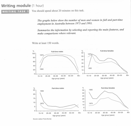
The line graph illustrates information about the number of men and women in full and part-time employment in Australia over a period of 20 years between 1973 and 1993.
In overall employment, the number of people working full time increased during this period, whereas the number of males working part-time was incredibly low, according to the line graph. Also, the number of female workers increased during some periods.
Initially, the number of full time males was incredibly high between the ages of 15-19 years and 55-59 years; it increased to over 80% in 1993, and it was less than 100% in 1973. However, the number of part time workers was unbelievably low, so the number of workers between 25-29 years and 55-59 years old was less than 5%, and it increased to over 5% in 1993.
Full time female employment was incredibly high. The figure was over 50% between 15-19 years old over 20 years, and it was 1-2% in 65 years old people. The number of part time workers from the female gender was highest between 15-19 and 85-89 years olds in 1993, whereas in 1973, 40-44 and 50-54 years old workers were in trend.
Word Count: 196