🔥 Today Only: Save 30% on Premium — Offer Ends Soon! - Upgrade Now!
Bar Chart

Band 6+: This graph shows the world meat production from 1950 to 1990. Describe the graph by your own words.

Image for topic: This graph shows the world meat production from 1950 to 1990. Describe the graph by your own words.
Our system will evaluate the answer based on this AI-generated description.
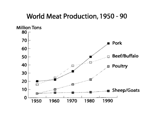
The image depicts a graph titled "World Meat Production, 1950 - 90" with the y-axis labeled "Million Tons" from 0 to 80, and the x-axis marked with the years 1950, 1960, 1970, 1980, and 1990. Four types of meat are plotted: Pork, Beef/Buffalo, Poultry, and Sheep/Goats. Pork production shows a steady increase from approximately 20 million tons in 1950 to around 70 million tons in 1990. Beef/Buffalo production starts at roughly 10 million tons in 1950 and escalates to near 50 million tons in 1990. Poultry production begins below 10 million tons in 1950, with a sharp climb to just over 30 million tons in 1990. Sheep/Goats production commences at about 5 million tons in 1950 and rises slightly above 10 million tons in 1990. Each data point is connected with lines, with Pork and Beef/Buffalo using solid lines and Poultry and Sheep/Goats using dashed lines.
Given the complexity of the image, the above description may not be entirely accurate.
Note: Both the topic and the answer were created by one of our users.

The chart illustrates world meat production, in between 1950 and 1990, and comparing production amount of pork, beef/buffalo meat, poultry and sheep/goat meat in million tons by year.

In 1950, production of sheep/goat meat was exactly the same with the poultry, around five million tons. Beef was following pork which was produced precisely 20 million tons, with just under the 20 million tons of production.

After 1950, poultry sky rocketed until 1990, reached to approximately 40 million tons by 1990, while sheep/goat meat production maintained the same level the whole time. Beef however, almost tripled its production and reached slightly under 50 million tons until 1990. Pork followed the same path with beef, and reached marginally above 60 million tons by 1990, and maintained its leadership in meat production industry.

Overall, there was no fluctuation, production didn’t decreased even once for any type of meat, only sheep/goat differed from the others with keeping its production amount steady, while the others were significantly increased.

Word Count: 163

Answers On The Same Topic:

This graph shows the world meat production from 1950 to 1990. Describe the graph by your own words.

The given line graph highlights the data about the global production of meat in four decades ,starting from 1950 to 1990. Overall, the proportion of pork beef and poultry showed a moderate upward trend between 1950 and 1990 , whereas the sheep production maintained the same level over the period. At the beginning of the […]

This graph shows the world meat production from 1950 to 1990. Describe the graph by your own words.

The given line graph highlights the data about the global production of meat in four decades starting from 1950 to 1990. Overall the proportion of pork beef and poultry showed a moderate upward trend between 1950 and 1990 , whereas the sheep production maintained the same level over the period. At the beginning of the […]

This graph shows the world meat production from 1950 to 1990. Describe the graph by your own words.

The line graph illustrates 4 different types of meat types in world production between 1950 and 1990. Overall, pork took the lead by rocketing and beef/buffalo and poultry increasedgradually over the period. However, sheep/goats keep unchanged in the least number. As regards pork and beef/buffalo began in similar number around 20 million tonnes in 1950. […]

This graph shows the world meat production from 1950 to 1990. Describe the graph by your own words.

The line graph illustrates the increasing tendency of production of diverse meat worldwide in 40 years. Overall, it can be seen that nearly all types of meat production increased their output by millions of tons. To begin with, the manufacture of pork raised its potential more than three times from the start of the shown […]

See All

Other Topics:

The chart below gives information about how families in one country spend their weekly income in 1968 and in 2018. Summarize the information by selecting and reporting the main features, and make comparisons where relevant.

The picture below compares average weekly spending by families between 1968 and 2018. Overall,the food consumption always requires a significant amount of money,especially in 2018,while fuel and power were the cheapest need for families.In addition,household goods are spent the same outlay through the period. In 1968,the food ranked 1st place in terms of expenses,demanding 35% […]

You should spend about 20 minutes on this task. The bar chart below gives information about vehicle ownership in China. Write a report for a university lecturer describing the information. You should write at least 150 words.

The bar chart illustrates the number of vehicles per thousand people in China between 1987 and 1999. Overall, the number of vehicles increase significantly throughout the period. In addition, the growth became much faster after 1995. The highest figure was recorded in 1999 While the lowest was in 1987. In 1987 there were only about […]

The bar chart below shows the percentage of government spending on roads and transport in 4 countries in the years 1990, 1995, 2000, 2005. Summarise the information by selecting and reporting the main features, and make comparisons where relevant.

Overall, while Italy, Portugal, and the UK decreased albeit at varying rates, the US remained stable throughout the period. It is also evident that Portugal recorded the highest figure throughout the period. Meanwhile, the UK showed the lowest proportion. Focusing fisrt on larger figures, the percentage of spending on roads in Portugal started at 27% […]

The bar chart shows the average size class in primary and lower secondary schools in 6 countries compared to the world average in 2006.

The bar chart illustrates the average class size in primary and secondary schools in six different countries, and compares these figures with the world average. In general, the world average number of pupils in a lower secondary school class was higher than the figure for primary schools. In addition, Asian countries (South Korea and Japan) […]

The chart below shows average prices per kilometre of clothing imported into the European Union from six different countries in 1993 and 2003 are shown in the bar chart below. Summarize the information by selecting and reporting the main features, and make comparisons where relevant.

The bar chart compares the price per kilometer of clothing imported into the European Union from six different nations in 1993 and 2003. Overall, the average price of importing clothes from China, India, and Bangladesh significantly rose from 1993 to 2003, whereas those from Argentina, Brazil, and Japan fell or remained unchanged. Moreover, while the […]

The bar chart below shows the spending of 18 - 20 people in five different activity.

The bar chart illustrates the expenditures of 18-20 aged people on five categories including food, clothes, books, smartphones and toiletries in one country between 2010 and 2014. Overall, while spending on food remained the most common in both years, a book section stood at the lowest level. In contrast, clothes category accounted for the similar […]

See All
We have detected unusual activity on your device.
Please verify your identity to continue.
Note: This verification step won't sign you in. If you have a premium account, please log in to access the service as usual.
Google/Gmail Verification
Or verify using Email/Code
We've sent a verification code to:
youremail@gmail.com (Not your email?)
Enter it below to complete the verification process.
Ensure your email address is correct, your inbox is not full, and you check your spam folder. If no email arrives, consider using an alternative email.
You will need a Premium plan to perform your action!
Note: If you already have a premium account, please log in to access our services as usual.

Plans & Pricing

Our mission is to make quality education accessible for everyone.
However, to keep our hardworking team running and this service alive, we genuinely need your support!
By opting for a premium plan, not only do you sustain us in achieving the mission, but you also unlock advanced features to enrich your learning experience.

Free

For learners who aren't pressed for time

What's included on Free
100+ Cambridge IELTS Tests
Instant IELTS Writing Task 1 & 2 Evaluation (2 times/month)
Instant IELTS Speaking Part 1, 2, & 3 Evaluation (5 times/month)
Instant IELTS Writing Task 1 & 2 Essay Generator (2 times/month)
500+ Dictation & Shadowing Exercises
100+ Pronunciation Exercises
Flashcards
Other Advanced Tools

Premium

For those serious about advancing their English proficiency, and for IELTS candidates aspiring to boost their band score by 1-2 points (especially in writing & speaking) in just 30 days or less

What's included on Premium
Save Your IELTS Test Progress
Unlock All Courses & IELTS Tests
Unlimited AI Conversations
Unlimited AI Writing Enhancement Exercises
Unlimited IELTS Writing Task 1 & 2 Evaluation
Unlimited IELTS Speaking Part 1, 2, & 3 Evaluation
Checked Answers Will Not Be Published
Unlimited IELTS Writing Task 1 & 2 Essay Generator
Unlimited IELTS Speaking Part 1, 2, & 3 Sample Generator
Unlimited Usage Of Advanced Tools
Priority Support within 24h (12-month plan only)

Due to the nature of our service and the provided free trials, payments are non-refundable.
Nếu bạn là người Việt Nam và không có hoặc không muốn trả bằng credit/debit cards, bạn có thể thanh toán bằng phương thức chuyển khoản:


Chọn gói:
419,000₫ 277,000 ₫ cho gói 1 tháng (chỉ 9,233₫/ngày)
1,239,000₫ 597,000 ₫ cho gói 3 tháng (chỉ 6,633₫/ngày)
2,469,000₫ 1,027,000 ₫ cho gói 6 tháng (chỉ 5,706₫/ngày)
4,929,000₫ 1,417,000 ₫ cho gói 12 tháng (chỉ 3,936₫/ngày)


Sau khi chuyển khoản, vui lòng đợi trình duyệt tự động điều hướng bạn trở lại Engnovate và bạn sẽ ngay lập tức nhận được mã kích hoạt tài khoản premium.
Nếu có lỗi xảy ra, bạn có thể liên hệ với team thông qua một trong các phương thức: email đến helloengnovate@gmail.com hoặc nhắn tin qua facebook.com/engnovate.
Vì toàn bộ công cụ trên website đều có thể sử dụng thử miễn phí, Engnovate không hỗ trợ hoàn tiền.