🔥 Today Only: Save 30% on Premium — Offer Ends Soon! - Upgrade Now!
Bar Chart

Band 6+: The bar chart provides information about seven categories of employment among adults in 2003 and 2013

Image for topic: The bar chart provides information about seven categories of employment among adults in 2003 and 2013
Our system will evaluate the answer based on this AI-generated description.
The image shows a bar chart representing the employment categories of adult population for the years 2003 and 2013. There are seven categories displayed: Education training, Hotel industry, Medical, Building, Business, Self-employed, and Unemployed. In 2003, Education training was around 10%, Hotel industry was slightly above 10%, Medical was around 5%, Building was approximately 40%, Business was slightly above 10%, Self-employed was approximately 17.5%, and Unemployed was slightly above 5%. In 2013, Education training was around 17.5%, Hotel industry was around 15%, Medical was approximately 7.5%, Building was approximately 20%, Business was approximately 32.5%, Self-employed was around 30%, and Unemployed was around 7.5%. There is a notable increase in Business and Self-employed categories, while Building saw a significant decrease from 2003 to 2013.
Given the complexity of the image, the above description may not be entirely accurate.
Note: Both the topic and the answer were created by one of our users.

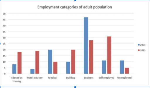
The bar chart illustrates the comparison between 7 types of adult population employment in 2003 and 2013. In general, the variation of jobs in the adult population was more even in 2013 compared to 2003, when business occupations were prevalent, while the least popular job was in the hotel industry.

In 2003, the population’s interest in working for the formal sector was dominant. Well over 45% of people had worked in business, while occupation in the medical field was precisely 20%, and the unemployment rate was just above 5%. Ten years later, the unemployment rate dropped to 5%.

In 2013, it was shown that careers in unconventional area became more appealing. A little over 30% of grown-ups were self-employed, meanwhile exactly 20% chose to work in building. The percentages of adults who worked in hotel industry was slightly higher than that of education and training (just bellow 20% and well above 15% respectively).

Word Count: 153

Answers On The Same Topic:

The bar chart provides information about seven categories of employment among adults in 2003 and 2013

The bar chart illustrates occupation categories of adult population in the US over the period Overall, in former year, business was the highest category while unemployment was the lowest category among all the other fields. To begin with, in 2003, the ratio of jobs stood at 7% for education training, that higher than hotel industries […]

The bar chart provides information about seven categories of employment among adults in 2003 and 2013

The bar chart provides information about the professional status of young adults in the US in 2003 and 2013. Overall, it can be seen that the percentage of business and self-employed jobs showed a significant increase during the period, while the proportion jobs of in the building and hotel industries experienced a relatively slower but […]

The bar chart provides information about seven categories of employment among adults in 2003 and 2013

The bar chart gives information about five different employment categories among adults in 2003 and 2013. Overall, there was an increase in the proportion of education training, hotel industry, building, and self-employment, whereas the reverse was true for the other three categories. Additionally, although business rate was the highest in 2003, the leading position was […]

The bar chart provides information about seven categories of employment among adults in 2003 and 2013

The given chart delineates the proportion of adults recruited in seven distinct categories across the US during 2003 and 2013. It is readily evident that applicants settled for one of the preponderant sectors like business, self employed, unemployed in both years. Additionally, hotel industry and building faced a descending trajectory, the reverse pattern can be […]

The bar chart provides information about seven categories of employment among adults in 2003 and 2013

The bar chart presents data regarding the distribution of employment among adults in 2003 and 2013 Overall, this period depict maginal changes in each occupations. In 2003, the highest proportions of employment were those studying and working in business, in 2013, self employed became the most prevalent option job in the given period. in 2003, […]

See All

Other Topics:

The chart below shows the percentages of the population in the UK who consumed the recommended daily amount of fruit and vegetables in 2002, 2006 and 2010.

The bar chart compares the proportion of men, women and children in the Uk who consumed the recommended daily intake fruits and vegetables between 2002 and 2010. Overall, it is clearly evident that women consumed the highest percentage of fruits and vegetables, whereas the figure for children had the lowest proportion of consumption throughout the […]

The chart below shows the donations given to six different types of charity byone company from 2012 to 2014.

The bar chart compares the donations by one company to six different charity organizations from 2012 to 2014, measured in thousands of dollars. Overall, social welfare accounted for accepting the highest donation in each year, while arts and environment accepted comparable donations over time. In contrast, health and wildlife saw a noticeable growth, whereas education […]

The chart below shows the donations given to six different types of charity by one company from 2012 to 2014. Summarize the information by selecting and reporting the main features and make comparisons where relevant. You should write at least 150 words.

This chart shows the donations that has given to 6 other types of charity by one company from 2012 to 2014. There are six different departments. The highest point of donations were given to Social Welfare. The lowest point of donations were at Arts department. Firstly; Social Welfare, Education and Environment department had a fluctuation […]

The chart shows components of GDP in Australia from 2012 to 2020.

The bar chart presents the percentage of Australian GDP constituents from finance and automotive domains between 2012 and 2020. Overall, the proportion of GDP from automotive and finance markedly increased over the period, with the former rising more moderately than the later. GDP gaps between these two sectors witnessed a gradual shrank before the year […]

The bar chart shows the number of homes,each worth 5 million US dollars or more,sold in eight cities

The bar chart illustrates the number of houses, costing 5 million dollars each, sold in eight distinct cities between 2009 and 2014. Overall, the highest sales figures belonged to London in both years, while the reverse was true for Dubai. Additionally, although all the rates underwent noticeable rises, that for Singapore dropped markedly. To begin […]

• Task 1: The chart below compares the percentage of time Australian mothers and fathers spent helping their children with four activities in 2013.

The bar chart compares how much time that parents in Australia spent assisting their children with various activities in 2013. Overall, mothers spent most of their time helping their children get dressed and doing homework, while playing games and preparing for bed made up the most time for both parents. Notably, the fathers spent the […]

See All
We have detected unusual activity on your device.
Please verify your identity to continue.
Note: This verification step won't sign you in. If you have a premium account, please log in to access the service as usual.
Google/Gmail Verification
Or verify using Email/Code
We've sent a verification code to:
youremail@gmail.com (Not your email?)
Enter it below to complete the verification process.
Ensure your email address is correct, your inbox is not full, and you check your spam folder. If no email arrives, consider using an alternative email.
You will need a Premium plan to perform your action!
Note: If you already have a premium account, please log in to access our services as usual.

Plans & Pricing

Our mission is to make quality education accessible for everyone.
However, to keep our hardworking team running and this service alive, we genuinely need your support!
By opting for a premium plan, not only do you sustain us in achieving the mission, but you also unlock advanced features to enrich your learning experience.

Free

For learners who aren't pressed for time

What's included on Free
100+ Cambridge IELTS Tests
Instant IELTS Writing Task 1 & 2 Evaluation (2 times/month)
Instant IELTS Speaking Part 1, 2, & 3 Evaluation (5 times/month)
Instant IELTS Writing Task 1 & 2 Essay Generator (2 times/month)
500+ Dictation & Shadowing Exercises
100+ Pronunciation Exercises
Flashcards
Other Advanced Tools

Premium

For those serious about advancing their English proficiency, and for IELTS candidates aspiring to boost their band score by 1-2 points (especially in writing & speaking) in just 30 days or less

What's included on Premium
Save Your IELTS Test Progress
Unlock All Courses & IELTS Tests
Unlimited AI Conversations
Unlimited AI Writing Enhancement Exercises
Unlimited IELTS Writing Task 1 & 2 Evaluation
Unlimited IELTS Speaking Part 1, 2, & 3 Evaluation
Checked Answers Will Not Be Published
Unlimited IELTS Writing Task 1 & 2 Essay Generator
Unlimited IELTS Speaking Part 1, 2, & 3 Sample Generator
Unlimited Usage Of Advanced Tools
Priority Support within 24h (12-month plan only)

Due to the nature of our service and the provided free trials, payments are non-refundable.
Nếu bạn là người Việt Nam và không có hoặc không muốn trả bằng credit/debit cards, bạn có thể thanh toán bằng phương thức chuyển khoản:


Chọn gói:
419,000₫ 277,000 ₫ cho gói 1 tháng (chỉ 9,233₫/ngày)
1,239,000₫ 597,000 ₫ cho gói 3 tháng (chỉ 6,633₫/ngày)
2,469,000₫ 1,027,000 ₫ cho gói 6 tháng (chỉ 5,706₫/ngày)
4,929,000₫ 1,417,000 ₫ cho gói 12 tháng (chỉ 3,936₫/ngày)


Sau khi chuyển khoản, vui lòng đợi trình duyệt tự động điều hướng bạn trở lại Engnovate và bạn sẽ ngay lập tức nhận được mã kích hoạt tài khoản premium.
Nếu có lỗi xảy ra, bạn có thể liên hệ với team thông qua một trong các phương thức: email đến helloengnovate@gmail.com hoặc nhắn tin qua facebook.com/engnovate.
Vì toàn bộ công cụ trên website đều có thể sử dụng thử miễn phí, Engnovate không hỗ trợ hoàn tiền.