🔥 Today Only: Save 30% on Premium — Offer Ends Soon! - Upgrade Now!
Bar Chart

Band 7+: the frequency of people in the US ate in fast food restaurants from 2003 to 1013

Image for topic: the frequency of people in the US ate in fast food restaurants from 2003 to 1013
Our system will evaluate the answer based on this AI-generated description.
The image displays a bar chart depicting the frequency of eating at fast food restaurants among people in the USA from 2003 to 2013. For 2003, the percentage of people eating fast food every day was below 5%; several times a week was approximately 15%; once a week was just over 20%; once or twice a month was approximately 33%; a few times a year was just over 15%; and never was approximately 10%. For 2006, the percentage of people eating fast food every day was around 7%; several times a week was about 17%; once a week was approximately 25%; once or twice a month was just below 30%; a few times a year was about 15%; and never was just below 5%. For 2013, the percentage of people eating fast food every day was approximately 3%; several times a week was about 15%; once a week was just over 30%; once or twice a month was just below 30%; a few times a year was about 15%; and never was just over 5%.
Given the complexity of the image, the above description may not be entirely accurate.
Note: Both the topic and the answer were created by one of our users.

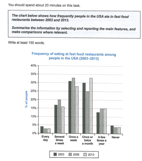
The bar chart illustrates the frequency of Americans eating in fast food restaurants in 2003, 2006, and 2013.

Overall, people eating in fast food restaurants once a week initially recorded the highest proportion; however, the habit eventually had shifted to be once or twice a month. By contrast, both every day and never categories showed the lowest shares.

In 2003, the proportion of Americans eating in fast food restaurants once a week accounted for 31%. The figures rose to a peak of 32.5% in 2006 before falling to 27.5% by 2013. Once or twice a month category ranked second, beginning at a sligthly lower point (30%). However, after falling to 25% in 2003, it rebounded to 32.5% by the final year, becoming the most common habit in this period. The next category cited by Americans was several times a week. Starting at 17%, the share increased to 20% but it then declined to 16% by 2013.

In comparison, 12.5% of Americans ate in fast food restaurants a few times a year. The proportion climbed to 15% in 2003 and remained stable afterwards. Both categories of never and every day eating in fast food restaurants occupied the bottom positions, making up roughly 4% throughout the period.

Word Count: 205

Answers On The Same Topic:

the frequency of people in the US ate in fast food restaurants from 2003 to 1013

The provided bar chart illustrates how often people in the USA ate in fast food restaurant from 2003 to 2013. Overall, most people ate in fast food in once a week and once or twice a month; every day and never these two categories had the lowest. Whereas, in 2006 was the once a week […]

the frequency of people in the US ate in fast food restaurants from 2003 to 1013

The bar chart presents the proportion of people eating in fast food restaurants, based on how often they come, across the years 2003,2006, and 2013. Overall, the majority of Americans initially visited fast food restaurants once a week, however, they changed this habit into once or twice a month by the final year. Meanwhile, the […]

the frequency of people in the US ate in fast food restaurants from 2003 to 1013

The bar chart illustrates the frequency with which people in the USA consumed fast food between 2003 and 2013. Six categories of eating habits are shown, ranging from “every day” to “never.” Overall, the majority of Americans ate fast food either once a week or once or twice a month throughout the period, while daily […]

the frequency of people in the US ate in fast food restaurants from 2003 to 1013

The bar chart illustrates the percentages of how often people ate in fast food restaurants in the US in the years 2003, 2006, and 2013. Overall, most of the US people enjoyed fast food restaurants either once per week or once or twice a month throughout the period, whereas the least people ate fast food […]

See All

Other Topics:

The graph shows the number of proficient English speakers from different countries by the year of their arrival in England and Wales. Summarise the information by selecting and reporting the main features, and make comparisons where relevant. Write at least 150 words

The bar chart compares the information of proficient english language speakers arrving in England and Wales from Europe and middle east and Asian countries by the year of their arriving. Overall, number of english speaker varied considerably over the years, Europe had the hightest number of english speaker as compared with middle east and asia […]

The graphs below give information about computer ownership as a percentage of the population between 2002 and 2010, and by the level of education for the years 2002 and 2010.

The bar chart illustrate an information about camputer ownership and it shows the literacy level from 2002 to 2010. Overall, computer ownership had always increased over the 10 years, the level of the education is presented in five different categories, these are: No high school diploma, High school graduate, Undergraduaate degree, Master’s degree, and Other […]

The bar charts below show the number of hours each teacher spent teaching in different schools in four different countries.

The bar charts illustrate the number of hours each teacher spent teaching in primary, lower secondary, upper secondary in four different countries (Japan, Spain, Iceland and the USA) in the year 2001 Overall, the USA recored the greatest number of teaching hours, whereas Japan had the lowest. Notaly, each teacher spent the most teaching hours […]

The chart below illustrates the amount of waste collected by a recycling centre between 2011 and 2015. Provide an overview of the information by identifying and describing the key details, and include comparisons where appropriate.

The linegraph delineates the amount of waste collected by a recycling centre over the span of 4 years, starting from 2011 to 2015. Overall, it is immediately apparent that there were similar trends in the quantities of paper, glass, tins and garden over the given period. Another outstanding feature is that the figure for paper […]

The chart below shows the main reasons why students chose to study at a particular university in the UK in 1995 and 2005. Summarize the information by selecting and reporting the main features, and make comparisons where relevant.

The dynamic chart illustrates the proportion of students who decided 5 different reasons when choosing a UK university from 1995 to 2005 . Overall, the majority of reasons saw an incline in importance over the period, while two factors saw a declining trend. In addition, suitable degree courses remained the most significant consideration in both […]

The chart below shows the results of a European survey into young people's expectations for change in five different areas of life in the next 20 years. They were asked if they thought things would improve or get worse.

The bar chart represents the expectations of young European people who participated in a survey about potential changes in five different aspects of life over the next two decades. Overall, it can be clearly seen that interpersonal communication recorded a high level of optimism, while air quality in urban areas were strongly believed to suffer […]

See All
We have detected unusual activity on your device.
Please verify your identity to continue.
Note: This verification step won't sign you in. If you have a premium account, please log in to access the service as usual.
Google/Gmail Verification
Or verify using Email/Code
We've sent a verification code to:
youremail@gmail.com (Not your email?)
Enter it below to complete the verification process.
Ensure your email address is correct, your inbox is not full, and you check your spam folder. If no email arrives, consider using an alternative email.
You will need a Premium plan to perform your action!
Note: If you already have a premium account, please log in to access our services as usual.

Plans & Pricing

Our mission is to make quality education accessible for everyone.
However, to keep our hardworking team running and this service alive, we genuinely need your support!
By opting for a premium plan, not only do you sustain us in achieving the mission, but you also unlock advanced features to enrich your learning experience.

Free

For learners who aren't pressed for time

What's included on Free
100+ Cambridge IELTS Tests
Instant IELTS Writing Task 1 & 2 Evaluation (2 times/month)
Instant IELTS Speaking Part 1, 2, & 3 Evaluation (5 times/month)
Instant IELTS Writing Task 1 & 2 Essay Generator (2 times/month)
500+ Dictation & Shadowing Exercises
100+ Pronunciation Exercises
Flashcards
Other Advanced Tools

Premium

For those serious about advancing their English proficiency, and for IELTS candidates aspiring to boost their band score by 1-2 points (especially in writing & speaking) in just 30 days or less

What's included on Premium
Save Your IELTS Test Progress
Unlock All Courses & IELTS Tests
Unlimited AI Conversations
Unlimited AI Writing Enhancement Exercises
Unlimited IELTS Writing Task 1 & 2 Evaluation
Unlimited IELTS Speaking Part 1, 2, & 3 Evaluation
Checked Answers Will Not Be Published
Unlimited IELTS Writing Task 1 & 2 Essay Generator
Unlimited IELTS Speaking Part 1, 2, & 3 Sample Generator
Unlimited Usage Of Advanced Tools
Priority Support within 24h (12-month plan only)

Due to the nature of our service and the provided free trials, payments are non-refundable.
Nếu bạn là người Việt Nam và không có hoặc không muốn trả bằng credit/debit cards, bạn có thể thanh toán bằng phương thức chuyển khoản:


Chọn gói:
419,000₫ 277,000 ₫ cho gói 1 tháng (chỉ 9,233₫/ngày)
1,239,000₫ 597,000 ₫ cho gói 3 tháng (chỉ 6,633₫/ngày)
2,469,000₫ 1,027,000 ₫ cho gói 6 tháng (chỉ 5,706₫/ngày)
4,929,000₫ 1,417,000 ₫ cho gói 12 tháng (chỉ 3,936₫/ngày)


Sau khi chuyển khoản, vui lòng đợi trình duyệt tự động điều hướng bạn trở lại Engnovate và bạn sẽ ngay lập tức nhận được mã kích hoạt tài khoản premium.
Nếu có lỗi xảy ra, bạn có thể liên hệ với team thông qua một trong các phương thức: email đến helloengnovate@gmail.com hoặc nhắn tin qua facebook.com/engnovate.
Vì toàn bộ công cụ trên website đều có thể sử dụng thử miễn phí, Engnovate không hỗ trợ hoàn tiền.