🔥 Today Only: Save 30% on Premium — Offer Ends Soon! - Upgrade Now!
Line Graph

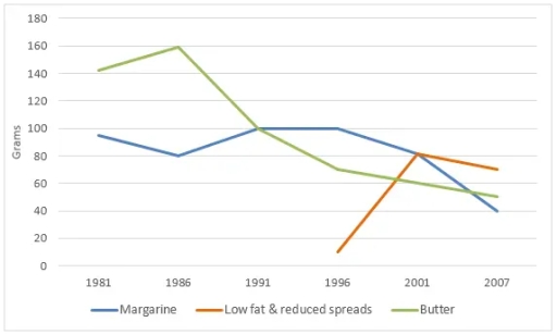
Band 5+: The graph below shows the daily consumption of three spreads per person from 1981 to 2007 in a country.

Image for topic: The graph below shows the daily consumption of three spreads per person from 1981 to 2007 in a country.
Our system will evaluate the answer based on this AI-generated description.
The image shows a line graph with three different lines representing Margarine, Low fat & reduced spreads, and Butter; X-axis ranges from 1981 to 2007 in intervals of 5 years except for the last interval which is 6 years, Y-axis measures grams from 0 to 180 in intervals of 20; In 1981, Margarine has the highest grams at 160, Low fat & reduced spreads start at 0, Butter at 140; In 1986, Margarine decreases to 100, Low fat & reduced spreads rise to 80, Butter drops to 120; In 1991, Margarine and Butter intersect at 80 grams while Low fat & reduced spreads peak at 160; In 1996, Margarine rises to 100, Low fat & reduced spreads slightly dip to 140, Butter falls to 40; In 2001, Margarine drops to 60, Low fat & reduced spreads decrease to 100, Butter remains at 40; In 2007, Margarine remains at 60, Low fat & reduced spreads fall to 80, and Butter increases to 60 grams.
Given the complexity of the image, the above description may not be entirely accurate.
Note: Both the topic and the answer were created by one of our users.

The line chart illustrates the amounts of butter, low fat and reduced spreads, margarine which were comsumed per day over the period from 1981 to 2007.

A cursory glance at the chart reveals a considerable oscillation in the 3 spreads that margarine and butter increased, the opposite was true for low fat and reduced spreads over the specified timeframe.

Within five fears from 1981 to 1986, while butter was used around 142 grams and then decreased minimally to 160 grams, Margarine was lower than butter from 90 grams to 80 grams. After 10 years, butter experienced significant drop with decreases of 90 grams. However, at the same time, the margarine consumption was relatively modest.

In 1996, low fat & reduced spreads turned up with a lowest gram and suddenly drastic inclination from 10 grams to 80 grams, which as high as that of margarine in 2001. At the beginning, while low fat and reduced spreads and butter had a stability, the margarine consumption declined by 50 grams.

Word Count: 167

Answers On The Same Topic:

The graph below shows the daily consumption of three spreads per person from 1981 to 2007 in a country.

The line graph illustrates the amount of butter, margarine, and low-fat and reduced spreads consumed per person in a country between 1981 and 2007. Overall, butter was the most popular spread at the beginning of the period, whereas low-fat and reduced spreads became the most widely consumed by the end. While butter and margarine generally […]

The graph below shows the daily consumption of three spreads per person from 1981 to 2007 in a country.

The line graph illustrates the daily consumption (in grams per person) of three types of spreads — margarine, low fat & reduced spreads, and butter — in a certain country over the period from 1981 to 2007. Overall, butter was the most consumed spread in 1981, but its popularity declined steadily throughout the period. Margarine […]

The graph below shows the daily consumption of three spreads per person from 1981 to 2007 in a country.

The given line graph highlights the daily consumption of three spreads per person between 1981 and 2001 in a country. Overall, the consumption of all spreads dramatically decreased from 1981 to 2007 except for low-fat and reduced spreads. It is clear from the given line graph that butter consumption increased steadily by 20 grams, while […]

The graph below shows the daily consumption of three spreads per person from 1981 to 2007 in a country.

The given line graph highlights the daily consumption of spreads three spreads per person between 1981 and 2001 in a country. Overall, The consumption of all spreads dramatically decreased from 1981-2007 excepting of Low fat & reduced spreads. It is clear from the given line graph that the butter increase steadily by 20 grams while […]

The graph below shows the daily consumption of three spreads per person from 1981 to 2007 in a country.

this graph illustrates the information about consumption of spreads over 26 year from 1981 to 2007. 1981 butter had main souce and it demand was very high which was around 140 grams after that it demand signifant growth till 1986 which was nearly 160 grams. But upcoming years it declined steadily and reach nearly 50 […]

See All

Other Topics:

The graph shows how much money was spent on foreign investment in real estate for four Asian countries from 2014 to 2024.

The provided map illustrates information about the amount of billions given Asian investment in foreign real estate between 2014 and 2024. Overall, the trend of Japan and Korea went up the top but China and Singapore dropped in 2024. As can be seen from the graph, in 2014 to 2018, the amount of China stayed […]

The line graph shows oil production and consumption in China between 1982 and 2006.

The line graph illustrates the oil manufacturing and consumption of oil in China from 1982 to 2006. Overall, there was a clear imbalance between oil consumption and manufacturing in China. While the oil manufacturing remained unchanged for over 20 years period, the oil consumption in China rose steadily over the period. Between 1982 to 1990, […]

The graph shows how much money was spent on foreign investment in real estate for four Asian countries from 2014 to 2024.

The presented line graph illustrates the amount of money which was used on four different nations in property between 2014 and 2024. A glance at the graph reveals that investment amounts in both China and Singapore had dropped significantly, while Korea and Japan had a sharp rise. Looking at the data in more detail, we […]

the graph below shows the proportion pf four different materials that were recycled from 1982 to 2010 in a particular country.

The line chart illustrates the amount of US dollars spent on cars in four different Asian countries. Overall, China spent the most on cars, and this spending increased significantly at the end of the mentioned period. Vietnam and Indonesia experienced a consistent rise in spending on cars. Thailand’s spending fluctuated up and down, and then […]

Look at the graph showing changes in the use of the internet for different activities in the future.

The line graph delineates anticipated changes in the extent to which the internet is employed for four distinct purposes – downloading films, sending emails, shopping and studying online courses – over the fifteen-year period from 2015 to 2030. Overall, the projections point to a pronounced divergence between the four purposes. While shopping and studying online […]

The graph below shows the four leading types of farming produce in Mitchford city between 1970-2000. Summarise the information by selecting and reporting the main features, and make comparisons where relevant.

THE line graph illustrate the production of four main agrucultural products , namely cotton, corn, wheat and sugar, in Mitchford between 1970and 2000 , measured in thousands of dollars . Owerall, cotton production experienced the most dramatic change , rising sharply to a peak of about $90,000 in 1990 before falling back to approximately $20,000 […]

See All
We have detected unusual activity on your device.
Please verify your identity to continue.
Note: This verification step won't sign you in. If you have a premium account, please log in to access the service as usual.
Google/Gmail Verification
Or verify using Email/Code
We've sent a verification code to:
youremail@gmail.com (Not your email?)
Enter it below to complete the verification process.
Ensure your email address is correct, your inbox is not full, and you check your spam folder. If no email arrives, consider using an alternative email.
You will need a Premium plan to perform your action!
Note: If you already have a premium account, please log in to access our services as usual.

Plans & Pricing

Our mission is to make quality education accessible for everyone.
However, to keep our hardworking team running and this service alive, we genuinely need your support!
By opting for a premium plan, not only do you sustain us in achieving the mission, but you also unlock advanced features to enrich your learning experience.

Free

For learners who aren't pressed for time

What's included on Free
100+ Cambridge IELTS Tests
Instant IELTS Writing Task 1 & 2 Evaluation (2 times/month)
Instant IELTS Speaking Part 1, 2, & 3 Evaluation (2 times/month)
Instant IELTS Writing Task 1 & 2 Essay Generator (2 times/month)
500+ Dictation & Shadowing Exercises
100+ Pronunciation Exercises
Flashcards
Other Advanced Tools

Premium

For those serious about advancing their English proficiency, and for IELTS candidates aspiring to boost their band score by 1-2 points (especially in writing & speaking) in just 30 days or less

What's included on Premium
Save Your IELTS Test Progress & Analyze Mistakes By Question Type
Save Your Own Flashcard Sets & Use Them On Any Device
Unlock All Courses, IELTS Tests, Section & Part Practice
Unlimited AI Conversations
Unlimited AI Writing Enhancement Exercises
Unlimited IELTS Writing Task 1 & 2 Evaluation
Unlimited IELTS Speaking Part 1, 2, & 3 Evaluation
Checked Answers Will Not Be Published
Unlimited IELTS Writing Task 1 & 2 Essay Generator
Unlimited IELTS Speaking Part 1, 2, & 3 Sample Generator
Unlimited Usage Of Advanced Tools & AI Features
Priority Support within 24h (12-month plan only)

Due to the nature of our service and the provided free trials, payments are non-refundable.