24 Hours Only: Get 39% OFF on Our Premium Plan - Check Out Now!
Multiple Graphs

Band 7+: The graphs below show the Expenditure on Health & Education, UAE as percentages of GDP and Infant mortality and life expectancy.

Image for topic: The graphs below show the Expenditure on Health & Education, UAE as percentages of GDP and Infant mortality and life expectancy.
Our system will evaluate the answer based on this AI-generated description.
The image contains two graphs; the top graph is a bar chart labeled 'Expenditure on Health & Education, UAE as % of GDP' and has three pairs of bars representing the years 1985, 1990, and 1993. In 1985, health expenditure was around 4.0%, and education was approximately 12.0%. In 1990, health was just under 6.0%, and education was around 8.0%. In 1993, health was about 6.5%, and education was approximately 13.5%. The bottom graph is a line chart labeled 'Infant Mortality and Life Expectancy, 1970 - 1992' with two lines, one for life expectancy (years) and the other for infant mortality (per 1000 births). In 1970, life expectancy was about 65 years, and infant mortality was roughly 80 per 1000 births. By 1992, life expectancy had increased to just under 75 years, whereas infant mortality had decreased significantly to about 20 per 1000 births.
Given the complexity of the image, the above description may not be entirely accurate.
Note: Both the topic and the answer were created by one of our users.

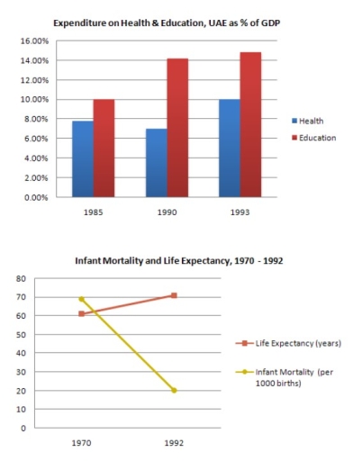
The graphs show the percentage of GDP spent on health and education in the UAE from 1985 to 1993, while they also illustrate the rates of life expectancy (in years) and infant mortality (per s thousand births) over a 22-year period starting from 1970.

Overall, the UAE has consistently been the highest percentage of GDP for education compared to health. Meanwhile, the number of life expectancy improved, and the infant mortality rate declined significantly.

Regarding education, the expenditure rose steadily, starting at around 10% and climbing to over 14% at the end of period — the largest number shown on the chart. There was a similar trend on health spending, which increased by around 2% within 8 years. It also recorded that health figures saw a small drop of 1% in 1990 before rising back to nearly 10% in 1993.

Turning to the second graph, it is evident that the figure of life expectancy has slightly increased over 10, reaching 70 in 1992. In contrast, the infant mortality rate dropped significantly, falling from 70 to 20 toward the end of the timeframe.

Word Count: 182

Answers On The Same Topic:

The graphs below show the Expenditure on Health & Education, UAE as percentages of GDP and Infant mortality and life expectancy.

The graphs show the percentage of GDP spent on health and education in the UAE between 1985 and 1993, and data on life expectancy and infant mortality from 1970 to 1992. Overall, spending on both sectors increased over time, and this was followed by a longer life expectancy and lower infant mortality. In 1985, around […]

The graphs below show the Expenditure on Health & Education, UAE as percentages of GDP and Infant mortality and life expectancy.

The bar chart given illustrates the proportions of expenditure on health and education in the UAE over a seven-year period, from 1985 to 1993, while the line graph elucidates the numbers of infant mortality and life expectancy over a twenty-two-year period, ending in 1992 . Viewed together, there appears to be a relationship between the […]

The graphs below show the Expenditure on Health & Education, UAE as percentages of GDP and Infant mortality and life expectancy.

The provided bar chart illustrates how much money UAE’s people spend on health and education over 8 years, from 1985 to 1993, measured in percentage of GDP and the second graph demonstrates the number of infant mortality rates per 1000 births and life expectancy per years from 1970 to 1992. Overall, it is apparent that […]

The graphs below show the Expenditure on Health & Education, UAE as percentages of GDP and Infant mortality and life expectancy.

The bar chart illustrates the percentages of health & education in 1985 to 1993 and the line graph depicts infant mortality and life expectancy between 1970 and 1992. Overall, education was the one that started and ended up with the highest rate compared with health from the bar chart while in the line graph life […]

The graphs below show the Expenditure on Health & Education, UAE as percentages of GDP and Infant mortality and life expectancy.

The bar chart compares the expenditure on health and education from 1985 to 1993 in UAE, while the line graph illustrates how life expectancy and infant mortality in UAE change between 1970 to 1992. We can observe from the bar chart that both spending on health and education in UAE increased from over the eight-year […]

See All

Other Topics:

The graph shows the number of global digital 3D screens (2005–2011), while the chart displays global 3D cinema releases (2005–2012) by animation and live-action films. Summarize the main features and make relevant comparisons.

The provided diagrame illustrates the count of global digital 3D screens(2005-2011), whereas the chart indicates global 3D cinema release(2005-2012), by animation and live-action. Overall, Global digital 3D screens showed steady growth before skyrocketing buy the end of 2011, regarding Global 3Dcinema releases, it had consistent growth, reaching its peak in 2012. To begin with,in 2005 […]

the chart below shows the amount of money per week spent on fast food in britain. the graph shows the trends in consumption of fast foods.

The chout below compare the expenditure and the consecmption og fast food per person in Britian. The measurements in the prest graph are pence per person, whereas in the second graph & the indicators are measured in grammes. Intel Overall, the indicators of hamburger showed the highest results in bath charts. By contrast, the numbers […]

The bar chart shows the number of volunteers in New Zealand who helped in sports organizations in 2010. The pie chart illustrates the number of volunteers doing different types of jobs for the same period. Summarize the information by selecting and reporting the main features, and make comparisons where relevant.

The bar chart and pie chart displays the proportion of volunteers and the number of duties they did in 2010. Overall, it is clear that most of the volunteers belonged to couple and dependent children, and the perfomed their duties as coach instructor or teacher. In terms of households, almost half of the volunteers came […]

The bar chart shows the number of volunteers in New Zealand who helped in sports organizations in 2010. The pie chart illustrates the number of volunteers doing different types of jobs for the same period. Summarize the information by selecting and reporting the main features, and make comparisons where relevant.

The bar chart illlustrates how many people in New Zealand volunteered to support sports organizations in 2010, while the pie chart shows the proportion of them by household types. Overall, the majority of New Zealanders who helped in sports organizations were coaches, instructors, and teachers, and the highest proportion of them were couples with dependent […]

The charts below show the percentage of students on an adult education center taking various courses offered in 1985 and this year. Summarize the information by selecting and reporting the main features, and make comparisons where relevant.

The supplied pie charts demonstrate the number of participants course choices on an adult education centre in the periods of 1985 and this year The units are given in percentage. Overall it,can be seen that in the past, the course of modern languages dominated the most alongside with the lessons of fitness and dance. However […]

The pictures show information about average income and spending on food and clothes by an average family in a city in the UK.

The table provides a information of average salary and spending on food and clothes of a family in a UK city in 2010 and 2013. Overall, it can be see that pie charts which illustrates the persent of different foods and clothes in two years. Fruit and vegetables and dairy products are increased, while meat […]

See All
We have detected unusual activity on your device.
Please verify your identity to continue.
Note: This verification step won't sign you in. If you have a premium account, please log in to access the service as usual.
Google/Gmail Verification
Or verify using Email/Code
We've sent a verification code to:
youremail@gmail.com (Not your email?)
Enter it below to complete the verification process.
Ensure your email address is correct, your inbox is not full, and you check your spam folder. If no email arrives, consider using an alternative email.
You will need a Premium plan to perform your action!
Note: If you already have a premium account, please log in to access our services as usual.

Plans & Pricing

Our mission is to make quality education accessible for everyone.
However, to keep our hardworking team running and this service alive, we genuinely need your support!
By opting for a premium plan, not only do you sustain us in achieving the mission, but you also unlock advanced features to enrich your learning experience.

Free

For learners who aren't pressed for time

What's included on Free
100+ Cambridge IELTS Tests
Instant IELTS Writing Task 1 & 2 Evaluation (2 times/month)
Instant IELTS Speaking Part 1, 2, & 3 Evaluation (5 times/month)
Instant IELTS Writing Task 1 & 2 Essay Generator (2 times/month)
500+ Dictation & Shadowing Exercises
100+ Pronunciation Exercises
Flashcards
Other Advanced Tools

Premium

For those serious about advancing their English proficiency, and for IELTS candidates aspiring to boost their band score by 1-2 points (especially in writing & speaking) in just 30 days or less

What's included on Premium
Save Your IELTS Test Progress
Unlock All Courses & IELTS Tests
Unlimited AI Conversations
Unlimited AI Writing Enhancement Exercises
Unlimited IELTS Writing Task 1 & 2 Evaluation
Unlimited IELTS Speaking Part 1, 2, & 3 Evaluation
Checked Answers Will Not Be Published
Unlimited IELTS Writing Task 1 & 2 Essay Generator
Unlimited IELTS Speaking Part 1, 2, & 3 Sample Generator
Unlimited Usage Of Advanced Tools

Due to the nature of our service and the provided free trials, payments are non-refundable.
Nếu bạn là người Việt Nam và không có hoặc không muốn trả bằng credit/debit cards, bạn có thể thanh toán bằng phương thức chuyển khoản:


Chọn gói:
279,000₫ 157,000 ₫ cho gói 1 tháng (chỉ 5,233₫/ngày)
819,000₫ 397,000 ₫ cho gói 3 tháng (chỉ 4,411₫/ngày)
1,649,000₫ 667,000 ₫ cho gói 6 tháng (chỉ 3,706₫/ngày)
3,299,000₫ 857,000 ₫ cho gói 12 tháng (chỉ 2,381₫/ngày)


Sau khi chuyển khoản, vui lòng đợi trình duyệt tự động điều hướng bạn trở lại Engnovate và bạn sẽ ngay lập tức nhận được mã kích hoạt tài khoản premium.
Nếu có lỗi xảy ra, bạn có thể liên hệ với team thông qua một trong các phương thức: email đến helloengnovate@gmail.com hoặc nhắn tin qua facebook.com/engnovate.
Vì toàn bộ công cụ trên website đều có thể sử dụng thử miễn phí, Engnovate không hỗ trợ hoàn tiền.