🔥 Today Only: Save 30% on Premium — Offer Ends Soon! - Upgrade Now!
Bar Chart

Band 6+: The bar chart provides information about seven categories of employment among adults in 2003 and 2013

Image for topic: The bar chart provides information about seven categories of employment among adults in 2003 and 2013
Our system will evaluate the answer based on this AI-generated description.
The image shows a bar chart representing the employment categories of adult population for the years 2003 and 2013. There are seven categories displayed: Education training, Hotel industry, Medical, Building, Business, Self-employed, and Unemployed. In 2003, Education training was around 10%, Hotel industry was slightly above 10%, Medical was around 5%, Building was approximately 40%, Business was slightly above 10%, Self-employed was approximately 17.5%, and Unemployed was slightly above 5%. In 2013, Education training was around 17.5%, Hotel industry was around 15%, Medical was approximately 7.5%, Building was approximately 20%, Business was approximately 32.5%, Self-employed was around 30%, and Unemployed was around 7.5%. There is a notable increase in Business and Self-employed categories, while Building saw a significant decrease from 2003 to 2013.
Given the complexity of the image, the above description may not be entirely accurate.
Note: Both the topic and the answer were created by one of our users.

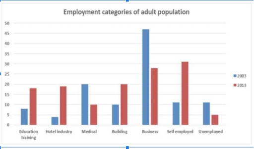
The proportions of adults employed in different spheres for 2003 and 2013 are depicted on the bar chart. Overall, while the percentages of employment in medical field, business and the index of unemployment diminished, the values of remaining 4 indicators increased.

In details, graph clearly illustrates the increase of employment in education training from approximately 7% in 2003 to a little below 20% in 2013. Similarly, as it is shown on the chart that the indicators of hotel and building industries changed from 4% and 10% to 19% and 20% respectively, both of this indexes had followed the same trend as the index of education training did. Interestingly, by growing for 20%, the percentage of self employed adults faced an increase also.

In contrast, medical sphere and business faced a decrease from 20% to 10% for medicine, and from 47% to 33% for business in employment rates. Additionally, graph shows that the index of unemployment decreased for approximately 6%.

Word Count: 159

Answers On The Same Topic:

The bar chart provides information about seven categories of employment among adults in 2003 and 2013

The bar chart compares adults population based on their employment category in two years : 2003 and 2013. In general, half of all categories have increased their volume in 10 years, and others sectors did opposite. Firstly, business sector was leading category, nevertheless within 10 year its’ rate declined. Medical sector fell sharply, and even […]

The bar chart provides information about seven categories of employment among adults in 2003 and 2013

The bar chart compares the employment categories of adults in different years (tell which years exactly). Overall, the difference between specialities became significantly less smaller. In 2013, almost all categories, except business and medical employment, experienced an increase in employees, except business and medical employment, and the number of unemployed people shrank noticeably. Specifically, education […]

The bar chart provides information about seven categories of employment among adults in 2003 and 2013

The bar chart illustrates occupation categories of adult population in the US over the period Overall, in former year, business was the highest category while unemployment was the lowest category among all the other fields. To begin with, in 2003, the ratio of jobs stood at 7% for education training, that higher than hotel industries […]

The bar chart provides information about seven categories of employment among adults in 2003 and 2013

The bar chart provides information about the professional status of young adults in the US in 2003 and 2013. Overall, it can be seen that the percentage of business and self-employed jobs showed a significant increase during the period, while the proportion jobs of in the building and hotel industries experienced a relatively slower but […]

The bar chart provides information about seven categories of employment among adults in 2003 and 2013

The bar chart gives information about five different employment categories among adults in 2003 and 2013. Overall, there was an increase in the proportion of education training, hotel industry, building, and self-employment, whereas the reverse was true for the other three categories. Additionally, although business rate was the highest in 2003, the leading position was […]

See All

Other Topics:

The graph below shows how the prices of apples and oranges changed between 2010 and 2014 in Australia.

The bar-chart provides information about how the value of apples and oranges per pound varied four-years period starting from 2010 and ending in 2014 in Australia. Overall cost of apples and oranges decreased in 2010, 2011 and 2012, whereas it increased in 2013 and 2014. Notably, the value of fruits in 2014 ranked first throughout […]

The graph below shows how the prices of apples and oranges changed between 2010 and 2014 in Australia.

The bar chart demonstrates the juxtaposes in the cost of the fruits in Australia, in terms of their variety-apple and orange- over the course of 5 subsequent years starting from 2010. Looking from all perspectives, it is crystally clear that both types become more expensive during this period. Notably, although the price of apple recorded […]

The chart below shows the number of immigrants to Germany by region in 2010 and 2020. Summarise the information by selecting and reporting the main features, and make comparisons where relevant

The given bar chart illustrates the number of immigrants between 2000 and 2010 to Germany by several countries such as Oceania,Africa,Europe,America,South and East Asia. Overall,it is clear that the highest number of immigrants of Europe in 2000, whereas the lowest number of immigrants took at South Asia in 2010. In 2010, immigrants of Oceania accounted […]

The bar chart below shows the figures for imprisonment in five countries between 1930 and 1980 (the y-axis shows the number of prisoners in thousands). Summarise the information by selecting and reporting the main features, and make comparisons where relevant.

The given bar chart illustrates the number of prisoners in five different countries- Great Britain, Australia, New Zealand, United States and Canada in the period of 50 years. Overall, the amount individuals in jails in Great Britain experienced an upward trend over the period. While remainning countries showed some fluctuates throughout the period. The number […]

The graph below shows information about the activities that New Zealand children enjoy doing the most in 2007.

The bar chart compares the percentages of boys and girls who take part in various types of activities. Overall, art and craft was the most popular activity among girls, whereas sports had the highest figure for boys. In contrast, sports was the least common choice among girls, while art and craft was the least popular […]

The figure shows the result of a survey of 1000 adolescents in five different countries. The participants were asked at what age they believed certain rights and responsibilities should be granted to young people.

The table illustrates the final results of a poll of 1000 adolescenrs across five various nations USA, UK, Mexico, Japan, and Egypt. The main question was at what age they thought certain rights and responsibilities should be provided to young people. Overall, it is clear that Japan had the highest suggested ages for all three […]

See All
We have detected unusual activity on your device.
Please verify your identity to continue.
Note: This verification step won't sign you in. If you have a premium account, please log in to access the service as usual.
Google/Gmail Verification
Or verify using Email/Code
We've sent a verification code to:
youremail@gmail.com (Not your email?)
Enter it below to complete the verification process.
Ensure your email address is correct, your inbox is not full, and you check your spam folder. If no email arrives, consider using an alternative email.
You will need a Premium plan to perform your action!
Note: If you already have a premium account, please log in to access our services as usual.

Plans & Pricing

Our mission is to make quality education accessible for everyone.
However, to keep our hardworking team running and this service alive, we genuinely need your support!
By opting for a premium plan, not only do you sustain us in achieving the mission, but you also unlock advanced features to enrich your learning experience.

Free

For learners who aren't pressed for time

What's included on Free
100+ Cambridge IELTS Tests
Instant IELTS Writing Task 1 & 2 Evaluation (2 times/month)
Instant IELTS Speaking Part 1, 2, & 3 Evaluation (2 times/month)
Instant IELTS Writing Task 1 & 2 Essay Generator (2 times/month)
500+ Dictation & Shadowing Exercises
100+ Pronunciation Exercises
Flashcards
Other Advanced Tools

Premium

For those serious about advancing their English proficiency, and for IELTS candidates aspiring to boost their band score by 1-2 points (especially in writing & speaking) in just 30 days or less

What's included on Premium
Save Your IELTS Test Progress & Analyze Mistakes By Question Type
Save Your Own Flashcard Sets & Use Them On Any Device
Unlock All Courses, IELTS Tests, Section & Part Practice
Unlimited AI Conversations
Unlimited AI Writing Enhancement Exercises
Unlimited IELTS Writing Task 1 & 2 Evaluation
Unlimited IELTS Speaking Part 1, 2, & 3 Evaluation
Checked Answers Will Not Be Published
Unlimited IELTS Writing Task 1 & 2 Essay Generator
Unlimited IELTS Speaking Part 1, 2, & 3 Sample Generator
Unlimited Usage Of Advanced Tools & AI Features
Priority Support within 24h (12-month plan only)

Due to the nature of our service and the provided free trials, payments are non-refundable.